Problem
Baja Blast’s existing visual language heavily emphasizes extreme energy and visual noise. While effective, it leaves little room for storytelling or mood. The challenge was to explore an alternate packaging direction that:
- Felt calmer and more illustrative without losing boldness
- Communicated flavor and atmosphere at a glance
- Differentiated Baja Blast from other Mountain Dew variants
The core problem was finding a balance between brand recognition and a more immersive, illustrative identity.
Research / Strategy / Design Decisions
Mid-century travel posters, vintage soda labels, and contemporary flat illustration styles informed the design direction. Research showed that simplified silhouettes, warm color overlays, and strong framing devices could create emotional appeal without overwhelming the viewer.
Key strategic decisions included:
-Shifting focus from aggressive angles to rounded, friendly forms
-Using palm trees, waves, and horizon lines as symbolic shorthand for “escape.”
-Introducing a limited, sun‑washed color palette to contrast Baja Blast’s typical high‑contrast look
-Allowing illustration to do the storytelling, with typography supporting rather than competing
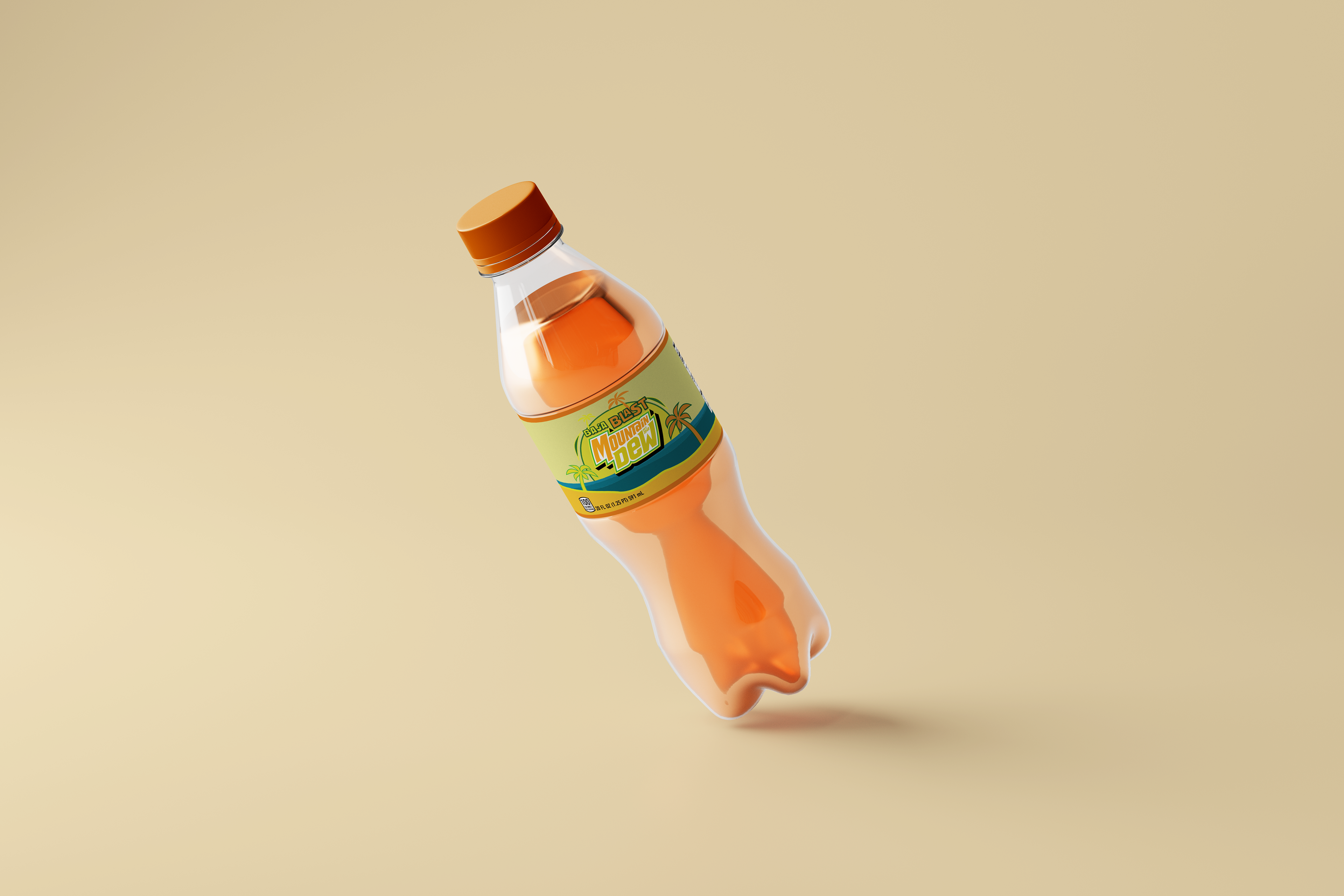
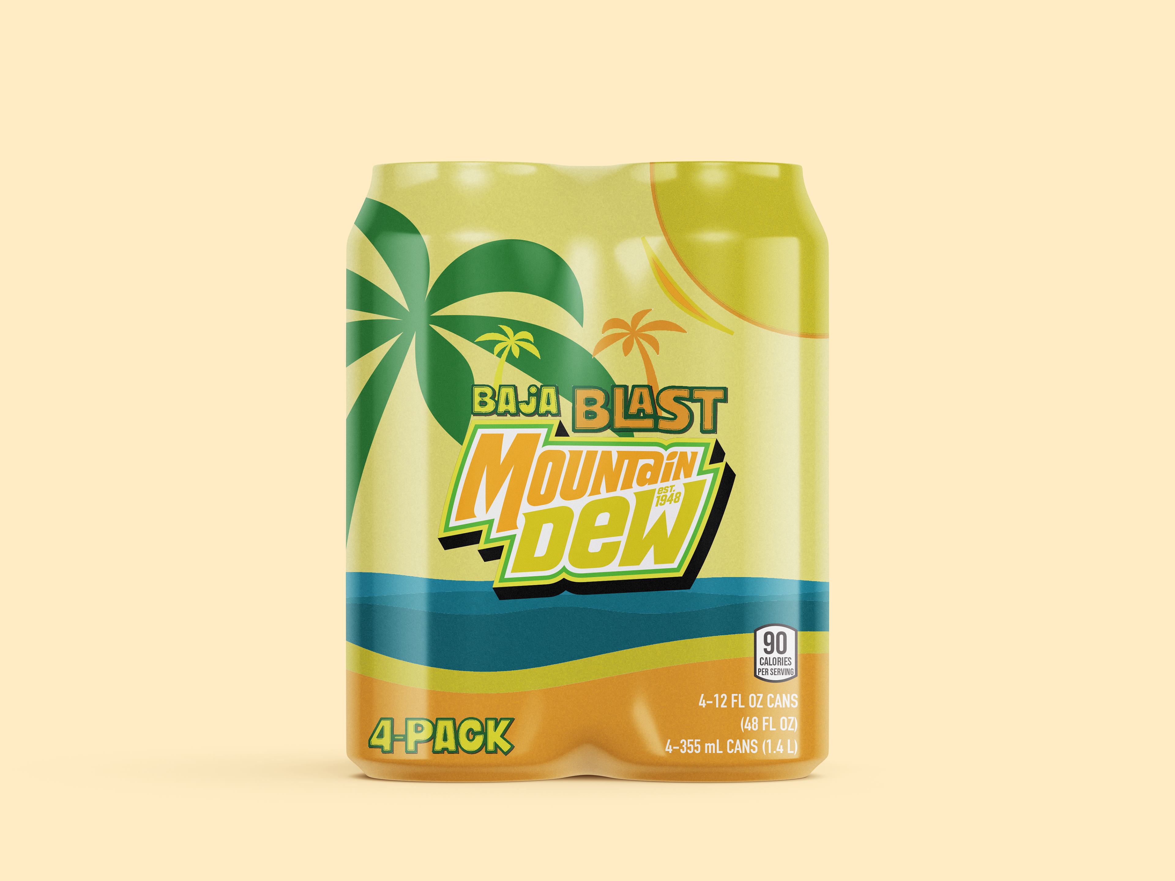
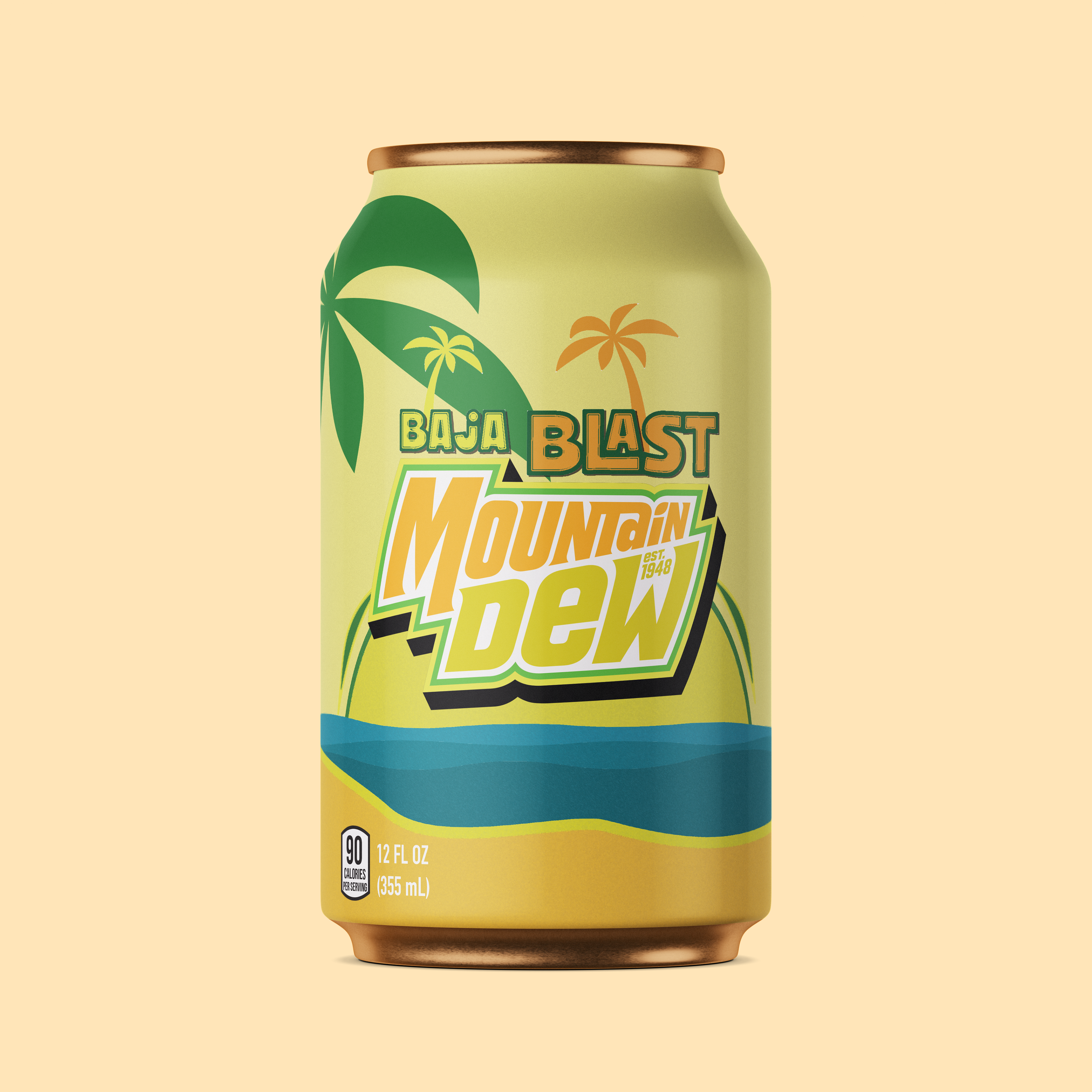
The System
The packaging system is built around a central illustrated scene that wraps the bottle and establishes place and mood.
- Illustration Style: Flat, graphic shapes with subtle texture and grain to add warmth and depth
- Color Palette: Muted teals, sandy yellows, and sunset oranges layered with soft gradients
- Iconography: Palm trees and wave forms used as repeatable motifs across the layout
- Hierarchy: The Mountain Dew logo remains the primary brand anchor, framed by the illustration, while Baja Blast is clearly highlighted above
This system creates a cohesive, poster‑like composition that reads instantly while rewarding closer inspection.
Challenges
One of the main challenges was ensuring the illustration‑forward approach still felt unmistakably Mountain Dew. With a softer color palette and simplified forms, careful attention was needed to maintain contrast and brand clarity.
Another challenge was integrating required packaging information—such as nutrition facts and volume—without disrupting the visual flow of the illustrated scene.
Outcomes
The final design presents Baja Blast as a destination rather than just a beverage. By embracing illustration, color restraint, and strong composition, the packaging feels collectible, playful, and emotionally driven.
Outcomes include:
-A distinct visual identity that stands apart from traditional Mountain Dew packaging
-A flexible illustration system adaptable to cans, bottles, and promotional materials
-A stronger sense of place and mood tied to the Baja Blast name
This project demonstrates how illustration‑led packaging can expand a brand’s visual language while maintaining recognition and impact.